Design Mistakes to Avoid
Designing can seem easy, but the details can take you down when it comes to print. Often designers feel confident working with free online software to create images for online, and it goes well. When creating artwork for print, many other factors need to be considered.
Adobe Creative Suite with Illustrator, Photoshop and In-Design is my go-to for design and photo editing. This software takes all print details into account when creating the document itself. But other software like Canva – you have to plan ahead to make sure the result is print worthy for output.
SET UP THE CORRECT RESOLUTION
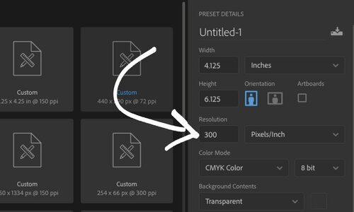
When viewing your artwork on the computer monitor, the size and clarity may appear sharp and crisp. But for print, it needs to be much larger to produce a vivid image on paper.
Each photo is made up of pixels or dots on the monitor. When downloading images off the internet at 100%, the resolution is 72 DPI (dots per inch). Print clarity demands 300 DPI for images in full color, spot color or black ink - keep the size at 100% or slightly larger for your print project. If you send a low-resolution (72 DPI) file to print, the outcome will be fuzzy and unprofessional. One way to check quickly is to check the size of the file, if the resolution is higher, the file size will also be higher.
If you are unsure about the resolution, give PPS a call, and we can check the file before you send the final artwork to print.
DON’T FORGET THE BLEED
Resolution isn’t the only crucial factor in setting up a file for print. Providing the bleed if your color or image stops at the cut mark allows the buffer that will keep the trim from having a thin white edge on it. Bleed is an extra margin around the edge of your design where any background elements that touch the edge of the page are extended slightly (usually .125 to .25 inches). If the size of the print image for a postcard was 4” x 6” – the full size would need to extend making the final size bleeding past the crop marks at .125 all the way around.
DESIGNING LOGOS
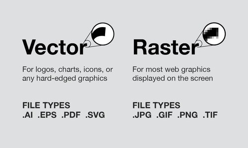
When working with vector files, using software like Adobe Illustrator, the artwork can be enlarged or reduced without losing any quality. Typically, it is preferred to design logos in vector art so it can be used in a variety of media and sizes – like brochures, business cards, large screen presentations or digital billboards.
The designer should provide each logo in a color version, a spot color version, and a black only version so the client has options.


